π οΈLayout
How to draw a top-down floor plan for a level, with flow and typology
Last updated
How to draw a top-down floor plan for a level, with flow and typology
Last updated
Layout has two similar meanings in level design:
the level's overall structure; "the layout was so confusing I didn't know where to go"
overview drawing used for planning, sometimes called a "topdown" because it's drawn from a top-down perspective; "have you finished drawing the layout? we need to blockout soon"
Layout drawings can be simple or complex, symbolic or representational, abstract or concrete. It can be a napkin scribble or a detailed floor plan, it all depends!
A "good layout drawing" is any image that effectively communicates the core design.
When designing a layout, utilize these design concepts:
Flow is how it feels to move around the level.
Does the player move quickly or slowly, smoothly or abruptly?
Desired flow depends on the experience goals. Abrupt flow isn't bad.
Critical path is the ideal path to complete a level.
Circulation is how real world architects think about flow.
Verticality is about supporting vertical flow.
Parti is the core structure / main idea of the layout.
What is the overall concept that binds the entire layout together?
A clear parti helps you focus on the most important parts of the design.
Typology is about common layout patterns and functions.
Simplify the way you think about the layout
Shared design vocabulary helps you study other levels and communicate.
There's no single best way to design a layout. Every person (and project) can make layouts in a different way. But if you feel lost, try doing everything:
Pre-production: define design goals
Parti thumbnails: brainstorm the core shapes
Bubble diagrams: visualize size / flow between areas
Floor plan: draft specific room shapes in more detail
Gameplay markup: add labels and design notes
For small solo jam projects, do as much (or as little) layout planning as you like.
For big group projects, try doing all these steps together on a shared whiteboard.
It is difficult to design something without any purpose. In a pre-production phase, we try to define and plan out what we want to make before we try making it.
So before drawing a layout, define at least one player experience goal. What should the player learn, feel, or do, in this level?
You can write specific experience goals ("teach the player how to double-jump in a sci-fi sewer for 5 minutes") or be more abstract ("feel one with nature"). But more specific = easier to design.
Once you have some goals, you can plan pacing, the sequence of specific events and activities that will help make the experience goal happen.
For example if your experience goal is "run away from scary monster" then you need to break down that experience into smaller specific beats -- like "(1) hear baby crying behind door, (2) reveal zombie bear making baby crying sound, (3) jump out window to escape monster." (This simple plan already helps a lot, now we know we'll need a door, a window, a bear...)
For more on planning experience goals, see Pre-production.
For more on planning activities and beats, see Pacing.
In architecture, the parti is the basic shape / idea of the entire building.
a. sketch a small simple diagram (thumbnail) b. label it with a short phrase
What type of basic shape fits with your experience goal / pacing plan?
The parti can be symbolic ("upside-down boat") or abstract ("box subtracted") or it can focus on how people will use the building ("core segregates public-private") or a relationship with the surrounding environment ("finger poking into the woods").
Or you can just vibe with some shapes and sort it out later. The point is to start thinking visually with no pressure. If you don't like a parti, no problem, you can just scribble another one.
Draw at least 5-10 thumbnails to generate multiple approaches. If you draw 100 partis, then at least one of those will be good, because it's impossible to design 100 terrible buildings. The more you draw, the more probability is on your side.
Don't spend too long on each one. Sometimes you only need 30 seconds to scribble some lines, and that'll be enough to express the core idea.
If you can't name it then maybe it's too raw. Try drawing it again in a different way, or try rotating the paper 180 degrees to imagine it from another angle.
Expand the most promising parti into a bubble diagram: a cluster of different ovals that each symbolize different rooms.
a. draw a bubble for each part of the parti b. label each bubble c. draw arrows to emphasize certain connections or directions
The goal of the bubble diagram is to establish proportions and relationships in your level. What needs to be big? What needs to connect to each other?
Don't worry about details yet. This is about the logic of your spaces.
Look at the example bubble diagram below. Which spaces connect to the living room and why? Why is the bathroom there? Where are the bedrooms? What if someone couldn't use stairs, how would they live in this house?
Your first few bubble diagrams will have problems and pose new questions. Some bubbles will be too big or too small, or they might touch the wrong bubbles. Maybe there are some bubbles you forgot to add? Or maybe there are too many bubbles.
A bad bubble diagram is good. That means you found the design problem early, and you can draw another one to try another arrangement.
Draw at least 3 bubble diagrams to imagine multiple arrangements and sizes.
You can deviate from the parti. The purpose of the parti was to help you start drawing bubbles. If it's not helping you anymore, then don't use it.
In architecture, a top-down layout drawing is called a floor plan.
a. imagine a plan cut, an imaginary horizontal slice through a building b. draw the structural shapes below this plan cut -- wall segments, doorways, windows, and significant furniture or fixtures c. to draw relevant objects above the plan cut, use dashed or dotted lines
In the diagram below, notice how Ching uses various line types, line weights, shading, and tonal patterns to differentiate parts of the floor plan. Ching thickens and darkens walls, but uses thinner lines to mark stairs or to denote areas of the house, and fainter lines for the arc of a rotating door.
START BIG. Use the entire page. Start with big main shapes and gradually work down to smaller features like doors and windows. Don't draw at 100% detail.
BE BOXY. Rectangles are easier to build than odd angles or curved walls. ~90%+ of your corners should be 90 degrees and aligned to the grid.
USE 2+ LINE THICKNESSES. Use different line weights for different types of walls.
THE PEN IS MIGHTIER. For quick layouts, use a pen or pencil.
WE'RE NOT ARCHITECTS. Draw the minimum needed to imagine the player experience.
Markup and label important parts of the layout drawing.
Flow. For single player levels, draw or mark the critical path. For multiplayer maps, lightly shade or highlight team spawn areas and primary circulation.
Areas. Label major areas and landmarks. For competitive multiplayer maps, start thinking about the possible "callouts".
Game Objects. Mark important objectives, NPCs, items, traps, etc. that are vital for understanding the player experience. But don't clutter the drawing with too much stuff.
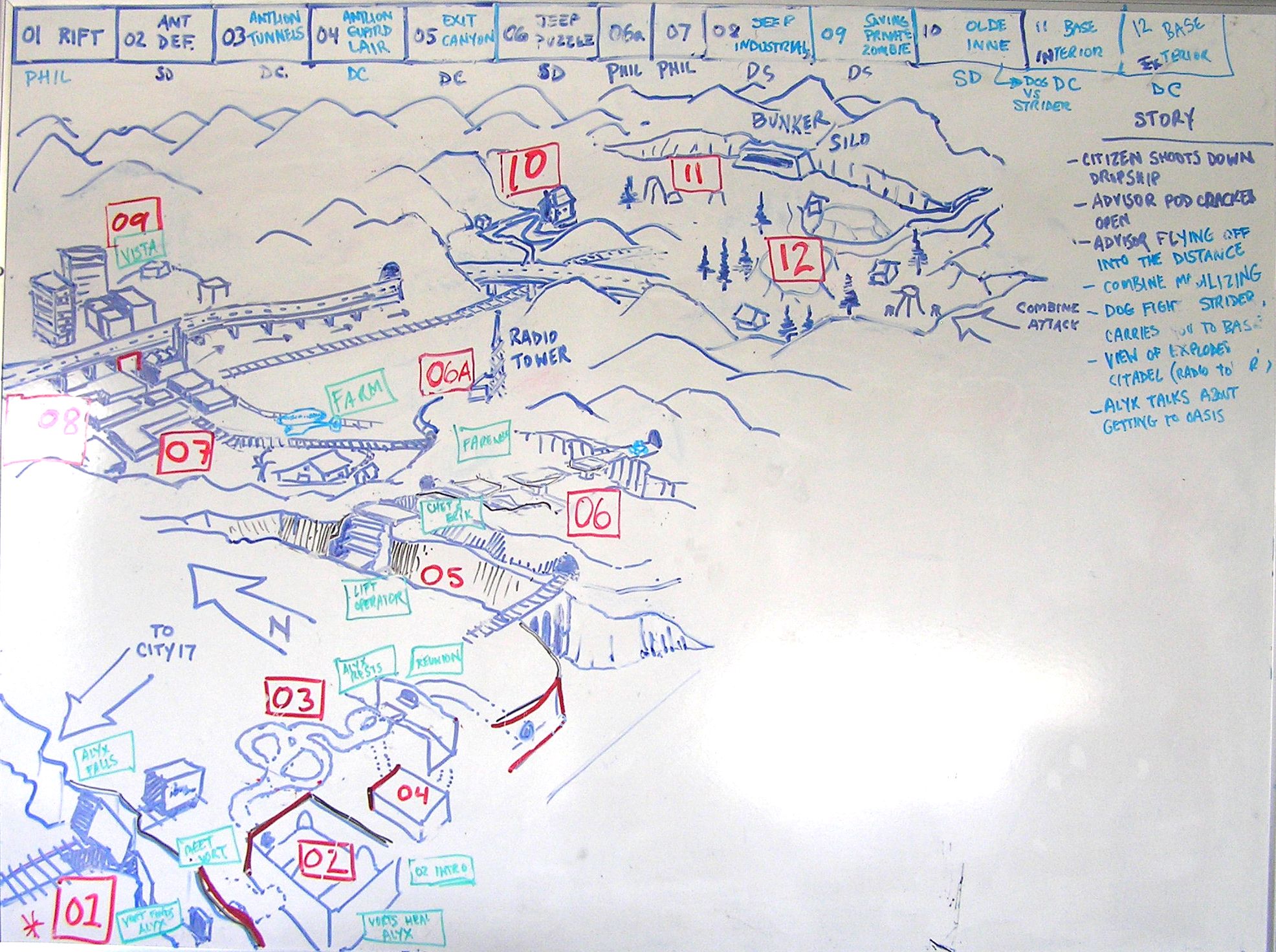
About 2/3 of the way through the single player FPS game Half-Life 2 (2004), the player must fight through a ruined prison complex called Nova Prospekt. It is a long chapter filled with many multi-floor close quarter combat encounters against fast moving squad enemies, designed to make heavy use of the player's "bugbait" weapon that can command flying "antlion" monsters to attack hostile soldiers.
Research: heavily inspired by Alcatraz State Penitentiary in San Francisco, California
Typology: ground-level arenas flanked with narrow catwalks and prison cells, frequently gated
Encounters: designed block-by-block, room-by-room, each section offers a central conceit that adds a new twist to the Antlion vs. Combine encounter space throughout the whole chapter
Notice how the Nova Prospekt plan (above, right) is a relatively simple layout drawing, marking out areas and how the player might progress through them. It omits the individual rooms and hallways inside each building. This is a layout image for a group of levels, not just one level. It is basically a bubble diagram, focusing on the footprint of each area and its connectivity.
For the individual cell blocks and encounters, Valve concept artist Eric Kirchmer incorporated level design and gameplay markup directly into the concept art sketches, which were likely the result of collaborative group whiteboard design sessions. These combat encounters have intended flows with idealized critical path "solutions", which treat each battle like a puzzle to be solved. These sketches provided valuable design documentation for level designer David Sawyer to blockout and prototype from.
In all the isometric layout drawings, note the heavy gameplay markup: player start location, critical path arrows, and heavy use of text labels to help us imagine the player experience.
For his single player Quake level, designer Andrew Yoder iterated on a setpiece encounter involving suspended cages in the middle of the room. Here, Yoder fluidly switches between layout and blockout repeatedly, sometimes discarding entire rooms and revisiting the design with layout sketches. Here's some of his notes:
"My process is about iteration, which sometimes means stepping back to planning stages. [...] Sometimes I spend an hour iterating on an area and it clicks. Other times I spend that same hour, and eh, maybe best to set it aside and try something else. [...] How do I tell? There's a gut feeling from experience building similar levels in the past. There are also a bunch of heuristics and patterns to check against. Does the player know the goal? Can they anticipate a solution and plan for it?"
Note the numbering, ample use of notes, labeling different parts of the sketch, and use of occasional perspective thumbnails to clarify the overall structure. Perspective thumbnails are especially useful when the level layout involves height changes, which are difficult to draw from a top down perspective.
The variety of sketches and copious markup helps Yoder communicate the intent of his design. The layout process helps Yoder verbalize and articulate the design problems.
For the open world hacking game Watch Dogs 2, designer Iuliu-Cosmin Oniscu built a mission with multiple objectives, entrances, and critical paths.
In his post "Watch Dogs 2 β Automata - a level design retrospective", he includes layout drawings with heavy gameplay markup and minimal architecture:
Some of the designer's notes and intentions:
In this particular scenario the trick was that the player could go through the lasers and trigger an alarm but he could also:
Disable the lasers when the guard was patrolling away from them and then go into the red zone and silently take the AI down.
Use the Camera attached to the walls to scout the location by traveling from camera angle to camera angle. At this point in the game this is an already well established way of scouting interior locations.
Use the drone to explore the hallway and incapacitate guards.
The corridor beyond also has a bunch of strategically placed junction boxes that can be hacked to incapacitate to incapacitate two guards at the same time.
Note how the level designer's drawing (pictured above) is much simpler than the actual in-game implementation (pictured below). Architectural details, furniture, and even some gameplay elements like neutral NPCs and wall-mounted cameras, aren't represented in the layout drawing. None of that is relevant to planning the core experience goal of bypassing security by knocking-out the guard NPCs.
The lesson here is: don't clutter your layout drawing with unnecessary design features.
In the class-based multiplayer shooter Team Fortress Classic (1999), "Warpath" was a control point ("CP") map designed collaboratively by Robin Walker and his team at Valve. TFC's CP game mode was similar to the modern CP modes in Team Fortress 2 or Overwatch, where two teams compete to capture all the control points along a central lane.
Flow: one central lane with side paths, 5 control points total with dynamic spawn rooms
Balance: symmetrical map, all 9 classes must be viable, attack / defense viable at each CP
Typology: beaded necklace, a long coiled corridor dotted with arenas for each CP
In the Half-Life 2 artbook "Raising The Bar", Walker details their process and how drawing layouts factor into their collaborative multiplayer level design workflow:
"After the initial design discussions, maps were sketched out by the design group, and then built by the level designers. Once the initial version was complete, regular playtesting began. Many changes were made throughout the playtesting cycle, often resulting in drastic changes to original plans for the map. [...] [Warpath] was the first TF map in which teams respawned in different locations based upon which control zones their team controlled, and this led to a long test cycle where respawn points were moved many times." -- Robin Walker, from "Half-Life 2: Raising The Bar", pg. 48 (emphasis ours)
In the drawing above, note the numbered control points and labeled call outs. Each control point area is like a mini arena / parti, with specific landmark labels: sniper ledge, tunnel, stone arch, barracks, etc. Name and theme map areas from the beginning. Labels also highlight the most important parts key to the map's experience goals.
Also note the drawing only shows half of the map, where the mirrored symmetry splits at the central bridge. Because they already decided the map layout would be symmetrical, drawing the entire map was unnecessary. Thus, design constraints affect how you draw your layout.
While layouts may seem vital for level design, many level designers do not draw layouts, and often jump from pre-production to blockout. Some arguments against making layout drawings:
You can't playtest a layout drawing.
Drawings are visual documentation that quickly become obsolete and out of date.
Real world architects do layouts because they have to; we shouldn't copy them mindlessly.
3D game movement relies more on intuition rather than calculation.
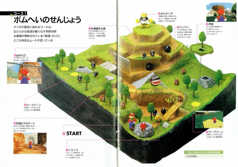
For the influential 3D platformer game Super Mario 64 (1996), Miyamoto's team made only minimal concept art / layout sketches to plan major pacing beats:
... When you created the level maps, did you draw out models/blueprints beforehand?Miyamoto: Actually, no, not at all. There would only be some concept art sketches, and brief notes/memos. For example, Iβd talk with course director Yoichi Yamada about an idea for a level, then heβd make some quick sketches of it. Yamada isnβt an artist, but he draws weird stuff. (laughs) Then weβd look over those and talk more (βoh, there should be a snowman here!β), and those key elements of the level would be written down. Yamada and the other level designers then would refer back to those notes while designing the levels with our software development tools.
-- interview from the Super Mario 64 Strategy Guide (via shmuplations.com)
A layout drawing (or a "layout") is an initial visual plan of the level's structure and key pacing beats. You should expect your final level to diverge significantly.
Start with a basic pre-production plan, define desired experience goals and pacing.
Sketch and label partis, simple thumbnail sketches of core shapes.
Arrange the space with bubble diagrams, sketches that emphasize overall proportion and relation.
Draw a floor plan, a top-down drawing with walls and floors.
Start with big simple shapes, omit details. Use multiple line weights and shade floor areas.
For rooms with multiple floors, draw an isometric view, with attention to the floor planes.
For important or complex set piece rooms, maybe sketch a perspective view and label it.
Markup the plan with player flow and gameplay notes. Help others imagine the experience, especially if you are collaborating with others.
Name and label areas. Think of each chunk of the level as its own parti.
That said, many level designers don't make layout drawings. Try it, and keep doing it if it helps you think, or if it helps your team communicate. However, don't feel obligated.
Read more about important layout design concepts.
Continue to the Blockout phase.
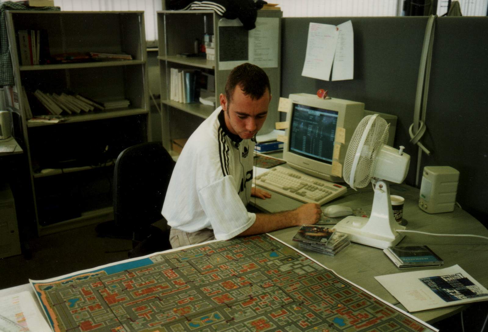
"Warowl and FMPone - Mapping for Fun" by 3kliksphilip